
The fintech market is full of mobile applications, but not all of them are convenient and understandable. I conducted more than a thousand in-depth interviews with users and found out that many of them stop using useful services because of an incomprehensible interface. Even the most favorable conditions offered by the product may not always influence the decision to remove the application. We are currently witnessing a real crisis in this area.
The creation of an intuitive interface of an application implies the implementation of a preconceived plan. The initial purpose of most successful services was quite different from the one that eventually resonated with users and promoted rapid growth.
To thoroughly understand the problem, it is helpful to "get the hang of it". "Failed" previous versions of a product often motivate teams to discern the right version of the app and exactly understand how the user’s mind will process it subconsciously.
The key task at the early stage of the intuitive application design process is not to perfectly implement a preconceived and described product, but to figure out what that product should look like, and how to remove unnecessary steps. The initial idea is just a starting point for finding something that works and is in demand.
The decision to move on to the full implementation of the product without a clear plan and analysis is often wrong. Many companies skip this part and start full-scale development based on an unproven hypothesis.
My vision of a successful plan is as follows:
- The team identifies key hypotheses that should be confirmed or rejected.
- The team tests the hypotheses in the cheapest and quickest way possible.
- After obtaining new information, the team formulates new hypotheses and tests them again.
- The cycle ends when all the key risks of the future mobile app are removed.
To keep the user from leaving halfway to the desired action, the design must anticipate their behavior.
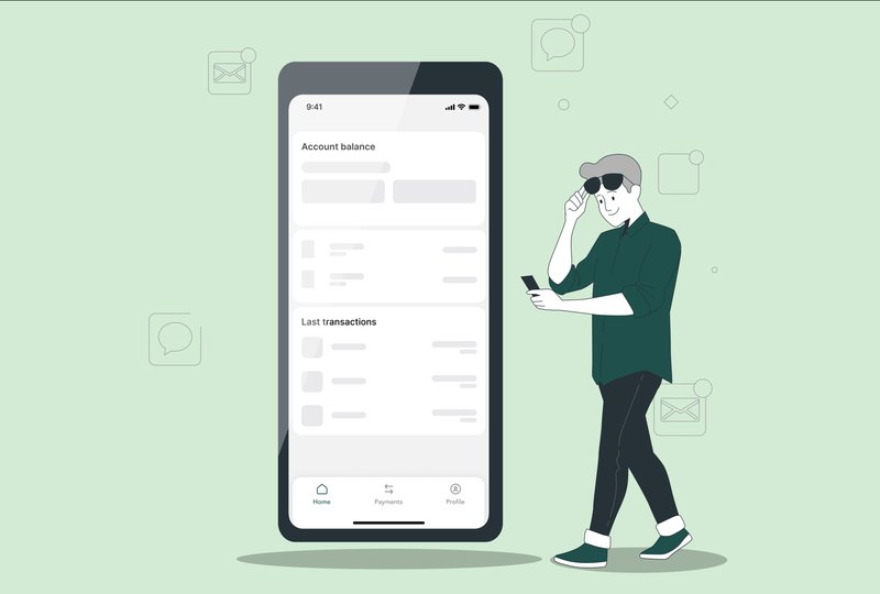
Understandable user interface as the basis for success.
Mobile apps can be frustrating due to a variety of factors. The in-depth analysis has shown that users are most often discouraged for the following reasons:
- A clutter of buttons and transitions: The application should be easily customizable and understandable, so that everyone can quickly figure it out and get started.
- Poor performance: If the service works slowly or often kicks the user out of the system, this can be a good reason not to use it.
- Poor compatibility: To reach a wider audience, the application should be compatible with different models of devices and operating systems. If a user can't install an app that is designed for Android on their iPhone, they won't buy a new phone and will simply leave.
- Unpleasant design: The abundance of bright colors, flashing buttons and constantly popping up links distracts users from their main purposes, which they have gotten this product for.
- Weak functionality: If the service enters the market under the slogan "we'll help you get a loan" but in fact it can't even handle the transfer of funds between wallets, it's unlikely that anyone will want to use it.
- Lack of logic and structure.
In the last 10 years, we have seen a trend toward intuitive services. Not so long ago, a smartphone you bought came with a detailed user manual in the box. Now all you can find in there are earphones and a charger. And the reason for that is not manufacturers trying to save paper. The same trend applies to mobile applications. Users feel satisfied when they can figure out complex functions on their own, without contacting technical support.
To maximize success when creating intuitive services, developers often work in teams with designers, usability engineers, and other specialists. This really helps create a product that meets user needs and expectations. To keep the interface simple and straightforward, teams use the combination of several methods of analysis:
- User research;
- Prototyping;
- Testing.
Many factors influence the convenient use of the service. The main ones include:
- Readability;
- Visibility;
- Load and response times;
- The ability of the interface to adapt to different screen resolutions and devices.
You and the user of your product are not the same thing.
UX design postulates that the opinions of developers, product teams, and product managers differ significantly from those of users. To put it simply, at the very least, the audience may not understand modern technology as clearly as the team working on the service does.
Touch interfaces and audio and video content reduce user literacy demands, thereby opening up access to digital technology for more people. On this basis, it is important to understand what level of education and skills the users of the product have. Not only the essence of the service, but also its ease of use are built on these principles.
The in-depth study of users helps you learn exactly how they think and what is important to them. In the process of analysis, you can discover new aspects that your competitors have missed out or even considered not so important. It is essential to identify the so-called "mental model" which describes the detailed characteristics of users. It is this data that allows developers to understand how people who use their products interact with the software interface.
If you don’t use thought patterns, this can cause difficulties for new users. Using my personal experience, I have identified several criteria that often confuse the customer:
- Gestures, more specifically swiping, dragging, and long pressing;
- Using usernames and passwords where it makes no sense;
- Strange icons, such as a spinning wheel that means a long wait;
- Using the QWERTY keyboard after the traditional numeric keypad on non-touchscreen devices;
- Decorative icons that have no practical use;
- Text boxes for tapping: Buttons and CTA elements that contain only text make it difficult for users to "scan" the text and create problems with understanding the interface.
As a solution to these kinds of problems, I can give the following suggestions:
- The use of additional cues and familiarization materials so that users could better understand how the service works.
- Captions in addition to icons. For example, by adding a description to the wheel symbolizing waiting, you can make sure that the person understands what it means.
- Animated images as an aid to the use of gestures.
- Video tutorials and short lessons.
I also deem it necessary to consider using shaded, circled or tinted buttons for important actions. This will help the user understand and identify which elements are interactive. As practice shows, it is best to integrate this regardless of where the buttons are located: on pages, cards, or dialogs. In this case, it is better to make do with text buttons without additional characters, as they create an unnecessary visual noise.
Along with this, the Floating Action Button (FAB) is an effective way to highlight the most important actions on the screen. Before that, however, users must figure out why the icon exists and what actions it activates. To help them do this, it is worth using an extended FAB which is a combination of an icon and text.
Actions that take up the entire width of the screen should be delimited by horizontal lines. This will help visually distinguish them from other elements on the screen, which is especially relevant for interfaces with a high density of elements and different colors.
Calls to action that include visual information such as backgrounds, icons, colors, or labels also become a kind of helper. It's a lot easier when these elements stand out among the rest of the content and can guide the customer through the app. Thus, the user is more likely to understand what each action is intended for. If they understand the meaning of the icon, all they have to do is to glance at the text label and use the function.
It is also important to take into account what competitors have done before. The secret to success lies in the study of past experience and the analysis of competitors' projects. After that, the data obtained is systematized, and the possible options are noted down.
Gamification as a way to retain the user.
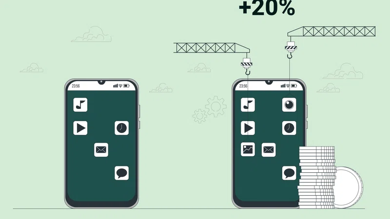
Gamification involves applying game dynamics to the mobile app, which encourages customers to return to the app. This approach can lead to an increase in traffic and user interest in the product. If the mobile service interface is implemented correctly, the whole gamification process is based on the principles of human psychology. Using this method, you can get a product that is completely user-centric and makes the customer journey more attractive and understandable.
Game elements create a gaming experience for users, while combining customer engagement with retention. In fact, gamification helps create a mobile app that delivers sustainable customer growth.
When integrating such features, it's important to make them really interesting, for example, create game tactics, and introduce different challenges and rewards. These techniques influence user behavior and create an engaging experience that encourages them to try the product again.
Gamification can also be used in short-term projects. Such features will be useful when creating promos, at the stage when there is an opportunity to give something to users.
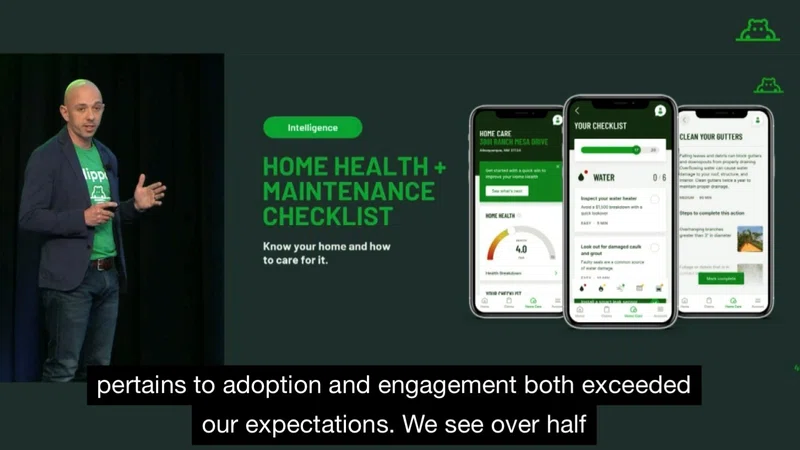
An example of successful gamification implementation can be seen in Todoist Karma. It is a productivity gaming app that measures user progress toward their goals. Its point system ranks and motivates players to achieve their dreams. If tasks are completed, players receive Karma; if not, they lose it. Thus, the user accepts the challenge and is rewarded after overcoming it. The advantage is that players have to achieve their goals again to maintain their status. Failure to handle challenges results in loss of points.
Another example is Epic Win, a gaming app for people who want to change their lives. Its RPG concept creates a fun experience for users who can measure their productivity using creative characters and playful animations. In Epic Win, every user sets, assigns and completes tasks. When players achieve their goal, their character is promoted in the system.
We can conclude from this that gamification can indeed be useful. However, there are some nuances to consider before introducing this feature. For instance, set a clear goal for improvement and find ways to reach it based on the characteristics of the target audience, such as age, interests, behavioral traits of customers and their feedback. You also need to give people value. A system of rewards and other bonuses would work for this.
It is important to keep in mind that gamification is not a conversion tool: if an application runs poorly, there is no point in trying to upgrade it. As for high-tech financial services, it is important to find the line between "playfulness" and "seriousness”. If a banking application positions itself as conservative and serious, we should be careful about introducing a game format.
Uniqueness and competitive differentiation.
The App Store and Google Play Store are filled with thousands of apps, but they often look alike in design and interface. This confuses users and prevents them from realizing the value of the product. If there is no visual difference, why should the customer choose something new?
At the service creation stage, product teams identify the distinctive brand and its mission. The design is developed as a consequence of an in-depth analysis of the market, product and target audience. We often have to apply some elements of UX templates used by competitors. There are certain patterns of customer behavior that cannot be violated. In this case, you can add uniqueness through UI, more convenient features and branding.
At the design stage, it is important to find a balance. If you go overboard with the UI and make a completely unique application, users may experience fear and feel reluctant to use this confusing product.
If users fail to figure it out, they will switch to competitors.
More often than not, difficulties in using an application center around not understanding the interface. This problem is relevant for users of any type of applications, including fintech apps, and it has become one of the main reasons for customers to make a decision to leave for a competitor.
However, it is worth noting that fintech applications, as a rule, aim to solve specialized tasks and may not be used by as wide a range of users as ordinary consumer services. Financial issues are already a certain stress for a novice, and if users encounter an incomprehensible application, it may even cause their persistent negative attitudes towards neobanking. This makes a well-designed interface especially important for the whole industry.
Nevertheless, difficulties in use are not the only reason for unsubscribing from the service. There are many related factors, such as unsatisfactory product quality or insufficient adaptation of its functionality to the needs of the audience.
All modern applications have the potential to become intuitive for their users. When developing a new one or improving an existing one, it is important to take a scrupulous approach to the rough design of the entire structure. Besides, the earlier the team starts testing on users, the faster and cheaper it will be to fix all the bugs and generate new ideas. It's just a matter of prioritization and building the right team.
To summarize, mobile apps can be inconvenient due to various factors, but the main ones are complexity of use, performance, compatibility, and design. Contextual help and structured information based on in-depth audience research are the most helpful for users in terms of mastering the service. It is important for developers to consider these factors when creating mobile products and not only focus on their beliefs, but also listen to their audience.